Designer: Sergei Egorov
Available for purchase at: www.rosettatype.com/neacademia
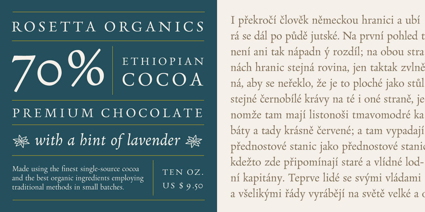
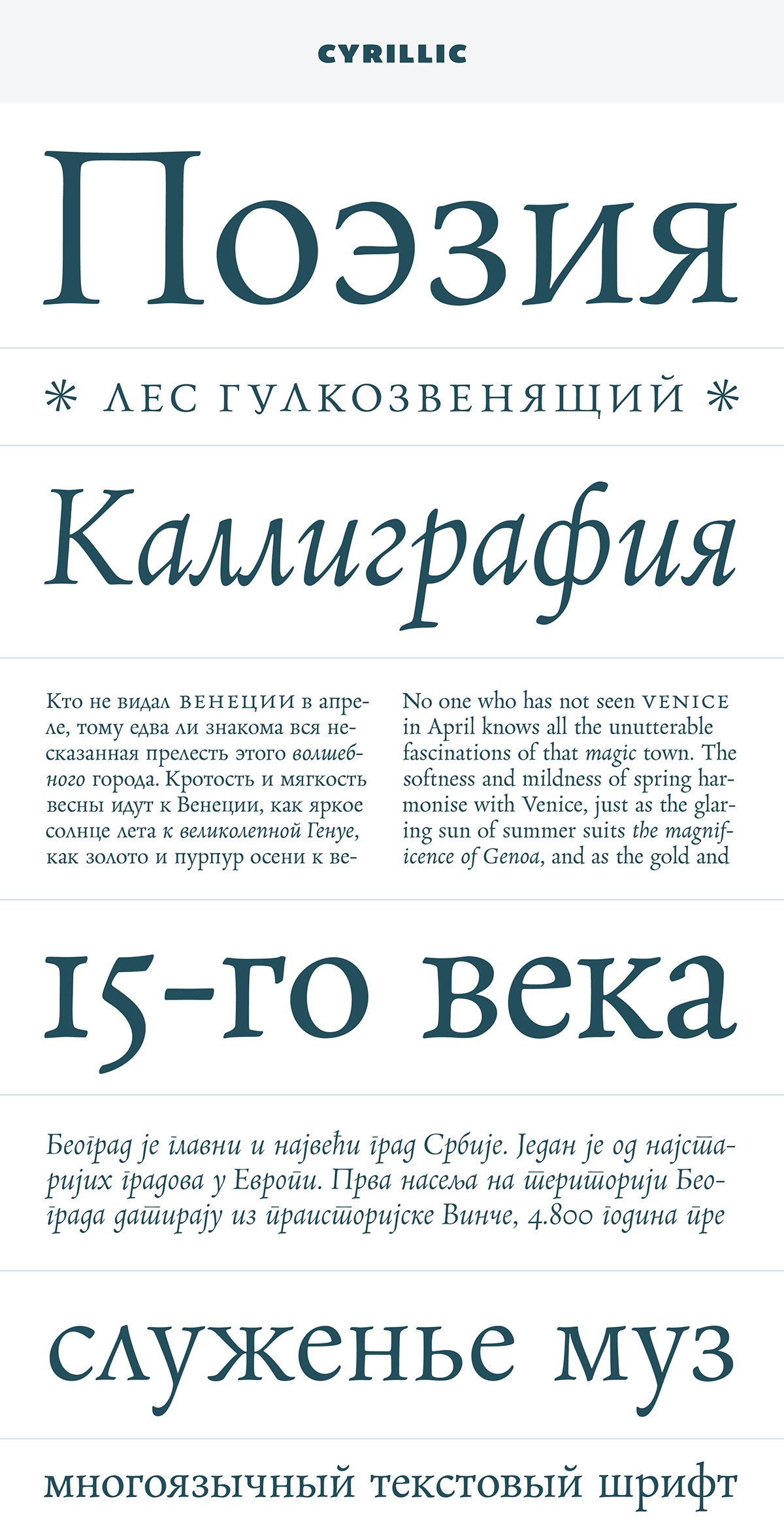
Neacademia is a Latin and Cyrillic type family inspired by the types cut by 15th century Italian punchcutter Francesco Griffo for the famous Venetian printer and publisher Aldus Manutius. The family comprises different versions optimised for specific point sizes, as was traditional in metal type. While the display sizes maintain a visual link to calligraphic roots, text sizes exhibit more typographic qualities, following the hand of the carver, not the calligrapher.
Neacademia was designed with specific allowances for letterpress photopolymer printing. Printed digitally, it can tolerate – and even benefit from – low resolution, rough paper, and low-grade presswork. It also adopts a more traditional approach to kerning and caps-spacing – instead of a multitude of kerning pairs, it makes use of alternative contextual letterforms. In many ways, it feels like using metal type again!
Available for purchase at: www.rosettatype.com/neacademia
Neacademia is a Latin and Cyrillic type family inspired by the types cut by 15th century Italian punchcutter Francesco Griffo for the famous Venetian printer and publisher Aldus Manutius. The family comprises different versions optimised for specific point sizes, as was traditional in metal type. While the display sizes maintain a visual link to calligraphic roots, text sizes exhibit more typographic qualities, following the hand of the carver, not the calligrapher.
Neacademia was designed with specific allowances for letterpress photopolymer printing. Printed digitally, it can tolerate – and even benefit from – low resolution, rough paper, and low-grade presswork. It also adopts a more traditional approach to kerning and caps-spacing – instead of a multitude of kerning pairs, it makes use of alternative contextual letterforms. In many ways, it feels like using metal type again!